Departments summary
The Departments summary provides a graphical view of how time was spent in each department.
The name of this summary changes as you drill up or down through your organization. For instance, the title could also be Team or Associates, depending on the data being shown.
Note: For more information on how to drill up or down, see Moving through your hierarchy.
The color-coded bars in the graph show the utilization of time for each department, team, or associate, with the total hours on the vertical axis. If you hover your mouse over a bar, Workforce Intelligence shows you detail information about the time spent in each time category.
Note: When you click a bar in the Departments summary, the other summaries on this page are filtered to reflect your selection. For instance, if you click the Wednesday bar, the Applications summary is updated to only show you the applications used on Wednesday.
The expected hours are entered by the associate. You can change the display to show hours instead of percentages by toggling these buttons in the top, right corner of the page:

When you have the percentage display toggled, the green line shows the expected production %, which provides a baseline productivity measure for each department and team. This percentage is arbitrarily assigned when Workforce Intelligence is implemented. For instance, you might set the production % for a team at 40% of the total expected hours.
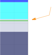
When you have the hours display toggled, the green line show the expected production hours.
This percentage is also used to calculate the expected production hours:
Expected hours * Production % = Expected production hours
