Workflow Summary (dashboard view)
When you click Analysis > Workflows from the menu, the dashboard view of the Workflow Summary is displayed. Use this dashboard to prioritize the workflows that you want to review.
The dashboard includes scores, insights, and a chart of the workflows. You can interact with data on the dashboard to access more detailed information, select metrics to update the workflow chart, or open a table summary with the workflows filtered by a specific insight, for example.
The top of the page shows you the time period that you selected and the department or team that you selected. You can change the time period to see desktop usage for any week, month, quarter, or year for which you have accumulated data. You can also choose a single day or just a few days. To change the department or team you are viewing, click the name to access a list of choices.

The Dashboard includes the following sections:
-
Scores
-
Insights
-
Workflows
Scores
The workflow scores help you identify the overall health of your workflows and which workflows require your attention.
Overall score: Provides the overall health of the workflow, based on the Efficiency, Complexity, and Friction scores of all paths in the workflow along with other criteria. This score is a weighted average that helps you determine which workflows might require more analysis.
Efficiency score: Indicates the amount of waste in a workflow. This score compares production and other work time to total time.
Complexity score: Shows the variability that is required to complete a workflow, including total applications and screens, unique applications and screens, and number of steps in a workflow.
Friction score: Notes how much interaction is needed to complete a step or workflow. This score is based on the number of steps, key presses, clicks, and scrolls in a workflow.
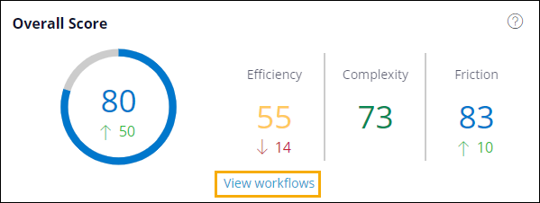
For all scores, higher numbers are better than lower numbers. If a score changed within the time period that you selected to view, the change and direction of the change are displayed under the score. For example, in the image above, the Friction score went up 10 points and is now an 83. This higher score and upward trend indicate that the amount of user interaction required to complete the workflow is probably not currently a concern. However, the Efficiency score has moved down 14 points to a 55. This lower score and downward trend indicate that you might need to look for ways to reduce waste in the workflow.
All of the scores are color-coded to make it easier to scan and identify areas for improvement.
blue = 80+
green = 60 - 79
yellow = 40 - 59
orange = 20 - 39
red = 0 - 19
The View workflows link at the bottom of this scores section enables you to access the Workflows table view.
Insights
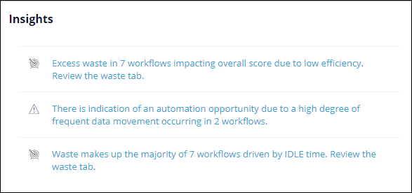
Insights help you identify and prioritize process improvement opportunities. Insights alert you to certain events in workflows and paths and offer suggestions for improvement. Insights are displayed when waste is over a certain threshold or when Workforce Intelligence detects an automation opportunity (for example, a significant amount of copy and paste content is detected). The following example shows the type of insights you might see. When you click an insight, you open the table view of the Workflow Summary with the insight applied as a filter. The summary table only shows workflows that are applicable to the insight.
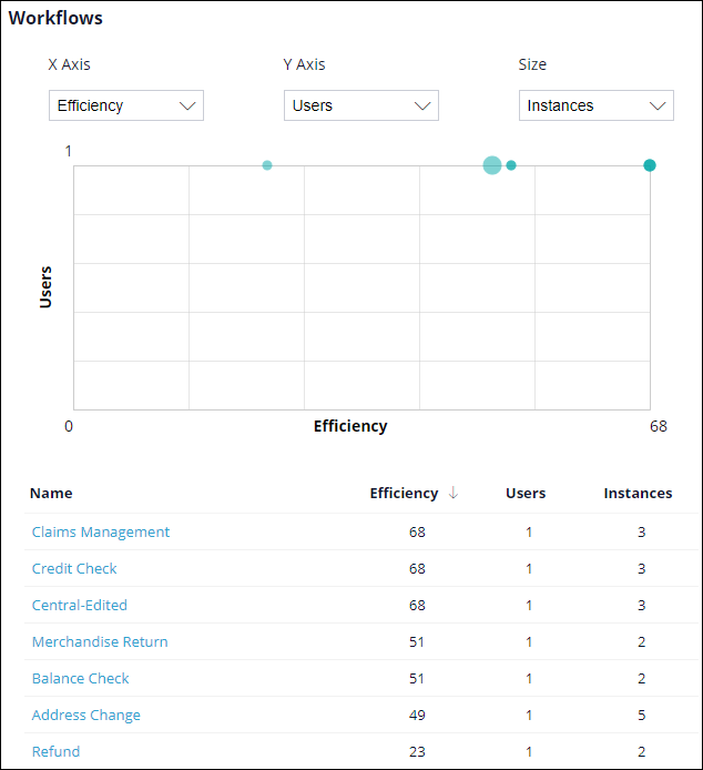
Workflows
You can select workflow metrics and scores from the X Axis, Y Axis, and Size drop-down lists to plot the workflows on the chart. The table below the chart provides a numeric view of the values you select. Click on a workflow name in the table to open the Workflow Details page for the workflow.